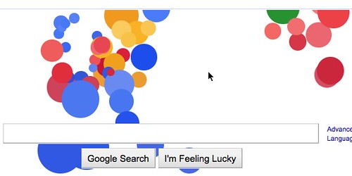
This is another example how Google are happy to play with their brand to show off some cool new browser technology (the other of course being the Pac Man logo a few weeks back). This, and the Pac Man is meant to show off what you can do with JavaScript and HTML5 and how smooth it can look on Chrome. My screenshot was taken with Firefox, so there is no racism in this code either – another plus in my book.
If you reverse engineer the code you will find that the bubbles are actually DIV elements that have a huge border radius. You can find the whole code of the effect in the source code when you look for google.doodle() or in this gist (beautified):
js file :
http://gist.github.com/raw/568067/f4c9326638cebacf295ab368c1010c2b90f1220b/googledoodle.js
css file :
http://gist.github.com/raw/568073/20be29340df25bd9baf265451a6c4975f9cef726/bubbles.css
Yes, all of this is pointless bells and whistles, but I have to say I like it that a company puts technology and showing it off just for a day on their agenda.
Update: the fact that the DOCTYPE of the site is HTML5 does not make this effect HTML5 though. It is simply a JavaScript that moves DIVs around and resizes them. This could be done in HTML4 and for IE6, too. The upgrade from classic DHTML animation is that it uses CSS3 to create the round bubbles and that nowadays this animation looks smooth on faster computers. In the time when IE6 was hot this would have looked terrible. Notice Google blocks IE from getting the effect (and sadly enough Opera, too, although it would work just fine with their JS engine).
Google goes bubbly - How does this happen
Labels: FUN Zone
Subscribe to:
Post Comments (Atom)


0 comments:
Post a Comment