Table of JSF Core Tags
| Tag | Description |
| f:view | Creates the top-level view |
| f:subview | Creates a subview of a view |
| f:facet | Adds a facet to a component |
| f:attribute | Adds an attribute (key/value) to a component |
| f:param | Constructs a parameter component |
| f:actionListener | Adds an action listener to a component |
| f:valueChangeListener | Adds a valuechange listener to a component |
f:setPropertyChangeListener (JSF 1.2) | Adds an action listener to a component that sets a bean property to a given value. |
| f:converter | Adds an arbitrary converter to a component |
| f:convertDateTime | Adds a datetime converter to a component |
| f:convertNumber | Adds a number converter to a component |
| f:validator | Adds a validator to a component |
| f:validateDoubleRange | Validates a double range for a component’s value |
| f:validateLength | Validates the length of a component’s value |
| f:validateLongRange | Validates a long range for a component’s value |
| f:loadBundle | Loads a resource bundle, stores properties as a Map |
| f:selectitems | Specifies items for a select one or select many component |
| f:selectitem | Specifies an item for a select one or select many component |
| f:verbatim | Adds markup to a JSF page |
Table 4–3 JSF HTML Tags
| Tag | Description |
| h:form | HTML form |
| h:inputText | Single-line text input control. Examples |
| h:inputTextArea | Multiline text input control. Examples |
| h:inputSecret | Password input control. Examples |
| h:inputHidden | Hidden field |
| h:outputLabel | Label for another component for accessibility |
| h:outputLink | HTML anchor. Examples |
| h:outputFormat | Like outputText, but formats compound messages |
| h:outputText | Single-line text output. Examples |
| h:commandButton | Button: submit, reset, or pushbutton. Examples |
| h:commandLink | Link that acts like a pushbutton. Examples |
| h:message | Displays the most recent message for a component |
| h:messages | Displays all messages |
| h:grapicImage | Displays an image. Examples |
| h:selectOneListbox | Single-select listbox. Examples |
| h:selectOneMenu | Single-select menu. Examples |
| h:selectOneRadio | Set of radio buttons. Examples |
| h:selectBooleanCheckbox | Checkbox. Examples |
| h:selectManyCheckbox | Set of checkboxes. Examples |
| h:selectManyListbox | Multiselect listbox. Examples |
| h:selectManyMenu | Multiselect menu. Examples |
| h:panelGrid | HTML table |
| h:panelGroup | Two or more components that are laid out as one |
| h:dataTable | A feature-rich table control |
| h:column | Column in a dataTable |
Table 4–4 Basic Attributes
| Attribute | Component Types | Description |
| id | A (25) | Identifier for a component |
| binding | A (25) | Reference to the component that can be used in a backing bean |
| rendered | A (25) | A boolean; false suppresses rendering |
| styleClass | A (23) | Cascading stylesheet (CSS) class name |
| value | I, O, C (19) | A component’s value, typically a value binding |
| valueChangeListener | I (11) | A method binding to a method that responds to value changes |
| converter | I, O (15) | Converter class name |
| validator | I (11) | Class name of a validator that’s created and attached to a component |
| required | I (11) | A boolean; if true, requires a value to be entered in the associated field |
A = all, I = input, O = output, C = commands, (n) = number of tags with attribute
Table 4–5 HTML 4.0 Pass-through Attributes
| Attribute | Description |
| accesskey (14) | A key, typically combined with a system-defined metakey, that gives focus to an element |
| accept (1) | Comma-separated list of content types for a form |
| accept-charset (1) | Comma- or space-separated list of character encodings for a form. The accept-charset attribute is specified with the JSF HTML attribute named acceptcharset. |
| alt (4) | Alternative text for nontextual elements such as images or applets |
| border (4) | Pixel value for an element’s border width |
| charset (3) | Character encoding for a linked resource |
| coords (2) | Coordinates for an element whose shape is a rectangle, circle, or polygon |
| dir (18) | Direction for text. Valid values are ltr (left to right) and rtl (right to left). |
| disabled (11) | Disabled state of an input element or button |
| hreflang (2) | Base language of a resource specified with the hrefhreflang may only be used with href. attribute; |
| lang (20) | Base language of an element’s attributes and text |
| maxlength (2) | Maximum number of characters for text fields |
| readonly (11) | Read-only state of an input field; text can be selected in a readonly field but not edited |
| rel (2) | Relationship between the current document and a link specified with the href attribute |
| rev (2) | Reverse link from the anchor specified with href to the current document. The value of the attribute is a space-separated list of link types. |
| rows (1) | Number of visible rows in a text area. h:dataTable has a rows attribute, but it’s not an HTML pass-through attribute. |
| shape (2) | Shape of a region. Valid values: default, rect, circle, poly. (default signifies the entire region) |
| size (4) | Size of an input field |
| style (23) | Inline style information |
| tabindex (14) | Numerical value specifying a tab index |
| target (3) | The name of a frame in which a document is opened |
| title (22) | A title, used for accessibility, that describes an element. Visual browsers typically create tooltips for the title’s value |
| type (4) | Type of a link; for example, "stylesheet" |
| width (3) | Width of an element |
(n) = number of tags with attribute
Table 4–6 DHTML Event Attributes
| Attribute | Description |
| onblur (14) | Element loses focus |
| onchange (11) | Element’s value changes |
| onclick (17) | Mouse button is clicked over the element |
| ondblclick (18) | Mouse button is double-clicked over the element |
| onfocus (14) | Element receives focus |
| onkeydown (18) | Key is pressed |
| onkeypress (18) | Key is pressed and subsequently released |
| onkeyup (18) | Key is released |
| onmousedown (18) | Mouse button is pressed over the element |
| onmousemove (18) | Mouse moves over the element |
| onmouseout (18) | Mouse leaves the element’s area |
| onmouseover (18) | Mouse moves onto an element |
| onmouseup (18) | Mouse button is released |
| onreset (1) | Form is reset |
| onselect (11) | Text is selected in an input field |
| onsubmit (1) | Form is submitted |
(n) = number of tags with attribute
Table 4–7 Attributes for h:form
| Attribute | Description |
| binding, id, rendered, styleClass | Basic attributes |
| accept, acceptcharset, dir, enctype, lang, style, target, title | HTML 4.0 attributes |
| onblur, onchange, onclick, ondblclick, onfocus, onkeydown, onkeypress, onkeyup, onmousedown, onmousemove, onmouseout, onmouseover, onreset, onsubmit | DHTML events |
Table 4–8 Attributes for h:inputText, h:inputSecret, h:inputTextarea,and h:inputHidden
| Attribute | Description |
| cols | For h:inputTextarea only—number of columns |
| immediate | Process validation early in the life cycle |
| redisplay | For h:inputSecret only—when true, the input field’s value is redisplayed when the web page is reloaded |
| required | Require input in the component when the form is submitted |
| rows | For h:inputTextarea only—number of rows |
| valueChangeListener | A specified listener that’s notified of value changes |
| binding, converter, id, rendered, required, styleClass, value, validator | Basic attributes |
| accesskey, alt, dir, disabled, lang, maxlength, readonly, size, style, tabindex, title | HTML 4.0 pass-through attributes—alt, maxlength, and size do not apply to h:inputTextarea. None apply to h:inputHidden. |
| onblur, onchange, onclick, ondblclick, onfocus, onkeydown, onkeypress, onkeyup, onmousedown, onmousemove, onmouseout, onmouseover, onselect | DHTML events. None apply to h:inputHidden. |
Table 4–9 h:inputText and h:inputSecret Examples
Table 4–10 h:inputTextarea Examples
Table 4–11 Attributes for h:outputText and h:outputFormat
| Attribute | Description |
| escape | If set to true, escapes <, >, and & characters. Default value is true. |
| binding, converter, id, rendered, styleClass, value | Basic attributes |
| style, title | HTML 4.0 |
Attributes for h:outputLabel
| Attribute | Description |
| for | The ID of the component to be labeled. |
| binding, converter, id, rendered, value | Basic attributes |
Table 4–12 Attributes for h:graphicImage
| Attribute | Description |
| binding, id, rendered, styleClass, value | Basic attributes |
| alt, dir, height, ismap, lang, longdesc, style, title, url, usemap, width | HTML 4.0 |
| onblur, onchange, onclick, ondblclick, onfocus, onkeydown, onkeypress, onkeyup, onmousedown, onmousemove, onmouseout, onmouseover, onmouseup | DHTML events |
Table 4–13 h:outputText and h:graphicImage Examples
Table 4–14 h:commandButton and h:commandLink
| Attribute | Description |
| action | If specified as a string: Directly specifies an outcome used by the navigation handler to determine the JSF page to load next as a result of activating the button or link If specified as a method binding: The method has this signature: String methodName(); the string represents the outcome |
| actionListener | A method binding that refers to a method with this signature: void methodName(ActionEvent) |
| charset | For h:commandLink only—The character encoding of the linked reference |
| image | For h:commandButton only—A context-relative path to an image displayed in a button. If you specify this attribute, the HTML input’s type will be image. |
| immediate | A boolean. If false (the default), actions and action listeners are invoked at the end of the request life cycle; if true, actions and action listeners are invoked at the beginning of the life cycle. See Chapter 6 for more information about the immediate attribute. |
| type | For h:commandButton: The type of the generated input element: button, submit, or reset. The default, unless you specify the image attribute, is submit. For h:commandLink: The content type of the linked resource; for example, text/html, image/gif, or audio/basic |
| value | The label displayed by the button or link. You can specify a string or a value reference expression. |
| accesskey, alt, binding, id, lang, rendered, styleClass, value | Basic attributes |
| coordsh:commandLinkdir, disabledh:commandButtonhreflangh:commandLinklang, readonly, relh:commandLinkrevh:commandLinkshapeh:commandLinkstyle, tabindex, targeth:commandLinktitle, type ( only), ( only), ( only), ( only), ( only), ( only), ( only), | HTML 4.0 |
| onblur, onchange, onclick, ondblclick, onfocus, onkeydown, onkeypress, onkeyup, onmousedown, onmousemove, onmouseout, onmouseover, onmouseup, onselect | DHTML events |
Table 4–15 h:commandButton Examples
Table 4–16 h:commandLink Examples
Table 4–17 Attributes for h:outputLink
| Attribute | Description |
| accesskey, binding, converter, id, lang, rendered, styleClass, value | Basic attributes |
| charset, coords, dir, hreflang, lang, rel, rev, shape, style, tabindex, target, title, type | HTML 4.0 |
| onblur, onchange, onclick, ondblclick, onfocus, onkeydown, onkeypress, onkeyup, onmousedown, onmousemove, onmouseout, onmouseover, onmouseup | DHTML events |
Table 4–18 h:outputLink Examples
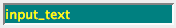
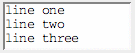
| Example | Result |
|  |
|  |
|  |
|  |
Table of Contents |  |
Table 4–19 Selection Tag Examples
Table 4–20 Attributes for h:selectBooleanCheckbox, h:selectManyCheckbox, h:selectOneRadio, h:selectOneListbox, h:selectManyListbox, h:selectOneMenu, h:selectManyMenu
| Attribute | Description |
| disabledClass | CSS class for disabled elements—for h:selectOneRadio and h:selectManyCheckbox only |
| enabledClass | CSS class for enabled elements—for h:selectOneRadio and h:selectManyCheckbox only |
| layout | Specification for how elements are laid out: lineDirection (horizontal) or pageDirectionh:selectOneRadio and h:selectManyCheckbox only (vertical)—for |
| binding, converter, id, immediate, styleClass, required, rendered, validator, value, valueChangeListener | Basic attributes |
| accesskey, border, dir, disabled, lang, readonly, style, size, tabindex, title | HTML 4.0—border is applicable to h:selectOneRadioh:selectManyCheckbox only. size is applicable to h:selectOneListbox and h:selectManyListbox only. and |
| onblur, onchange, onclick, ondblclick, onfocus, onkeydown, onkeypress, onkeyup, onmousedown, onmousemove, onmouseout, onmouseover, onmouseup, onselect | DHTML events |
Table 4–21 Attributes for f:selectItem
| Attribute | Description |
binding, id | Basic attributes |
| itemDescription | Description used by tools only |
| itemDisabled | Boolean value that sets the item’s disabled property |
| itemLabel | Text shown by the item |
| itemValue | Item’s value, which is passed to the server as a request parameter |
| value | Value binding expression that points to a SelectItem instance |
Attributes for f:selectItems
| Attribute | Description |
binding, id | Basic attributes |
| value | Value binding expression that points to a SelectItem, an array or Collection of SelectItem objects, or a Map mapping labels to values. |
Table 4–22 Attributes for h:message and h:messages
| Attribute | Description |
| for | The ID of the component whose message is displayed—applicable only to h:message |
| errorClass | CSS class applied to error messages |
| errorStyle | CSS style applied to error messages |
| fatalClass | CSS class applied to fatal messages |
| fatalStyle | CSS style applied to fatal messages |
| globalOnly | Instruction to display only global messages—applicable only to h:messages. Default: false |
| infoClass | CSS class applied to information messages |
| infoStyle | CSS style applied to information messages |
| layout | Specification for message layout: table or list—applicable only to h:messages |
| showDetail | A boolean that determines whether message details are shown. Defaults are false for h:messages, true for h:message. |
| showSummary | A boolean that determines whether message summaries are shown. Defaults are true for h:messages, false for h:message. |
| tooltip | A boolean that determines whether message details are rendered in a tooltip; the tooltip is only rendered if showDetail and showSummary are true |
| warnClass | CSS class for warning messages |
| warnStyle | CSS style for warning messages |
| binding, id, rendered, styleClass | Basic attributes |
| style, title | HTML 4.0 |
Table 4–23 Attributes for h:panelGrid
| Attribute | Description |
| bgcolor | Background color for the table |
| border | Width of the table’s border |
| cellpadding | Padding around table cells |
| cellspacing | Spacing between table cells |
| columnClasses | Comma-separated list of CSS classes for columns |
| columns | Number of columns in the table |
| footerClass | CSS class for the table footer |
| frame | frame Specification for sides of the frame surrounding the table that are to be drawn; valid values: none, above, below, hsides, vsides, lhs, rhs, box, border |
| headerClass | CSS class for the table header |
| rowClasses | Comma-separated list of CSS classes for columns |
| rules | Specification for lines drawn between cells; valid values: groups, rows, columns, all |
| summary | Summary of the table’s purpose and structure used for non-visual feedback such as speech |
| binding, id, rendered, styleClass, value | Basic attributes |
| dir, lang, style, title, width | HTML 4.0 |
| onclick, ondblclick, onkeydown, onkeypress, onkeyup, onmousedown, onmousemove, onmouseout, onmouseover, onmouseup | DHTML events |
Table 4–24 Attributes for h:panelGroup
| Attribute | Description |
| binding, id, rendered, styleClass | Basic attributes |
| style | HTML 4.0 |
Table 5–1 Attributes for h:dataTable
| Attribute | Description |
| bgcolor | Background color for the table |
| border | width of the table's border |
| cellpadding | Padding around table cells |
| cellspacing | Spacing between table cells |
| columnClasses | comma-separated list of CSS classes for columns |
| first | index of the first row shown in the table |
| footerClass | CSS class for the table footer |
| frame | Specification for sides of the frame surrounding the table should be drawn; valid values: none, above, below, hsides, vsides, lhs, rhs, box, border |
| headerClass | CSS class for the table header |
| rowClasses | comma-separated list of CSS classes for rows
|
| rules | Specification for lines drawn between cells; valid values: groups, rows, columns, all |
| summary | summary of the table's purpose and structure used for non-visual feedback such as speech |
| var | The name of the variable created by the data table that represents the current item in the value |
| binding, id, rendered, styleClass, value | Basic attributes |
| dir, lang, style, title, width | HTML 4.0 |
| onclick, ondblclick, onkeydown, onkeypress, onkeyup, onmousedown, onmousemove, onmouseout, onmouseover, onmouseup | DHTML events |
Attributes for h:column
| Attribute | Description |
| headerClass (JSF 1.2) | CSS class for the column's header |
| footerClass (JSF 1.2) | CSS class for the column's footer |
| binding, id, rendered | Basic attributes |
Table 6–1 Attributes for f:convertNumber
| Attribute | Type | Value |
| type | String | number (default), currency , or percent |
| pattern | String | Formatting pattern, as defined in java.text.DecimalFormat |
| maxFractionDigits | int | Maximum number of digits in the fractional part |
| minFractionDigits | int | Minimum number of digits in the fractional part |
| maxIntegerDigits | int | Maximum number of digits in the integer part |
| minIntegerDigits | int | Minimum number of digits in the integer part |
| integerOnly | boolean | True if only the integer part is parsed (default: false) |
| groupingUsed | boolean | True if grouping separators are used (default: true) |
| locale | java.util.Locale | Locale whose preferences are to be used for parsing and formatting |
| currencyCode | String | ISO 4217 currency code to use when converting currency values |
| currencySymbol | String | Currency symbol to use when converting currency values |
Table 6–2 Attributes for f:convertDateTime
| Attribute | Type | Value |
| type | String | date (default), time, or both |
| dateStyle | String | default, short, medium, long, or full |
| timeStyle | String | default, short, medium, long, or full |
| pattern | String | Formatting pattern, as defined in java.text.SimpleDateFormat |
| locale | java.util.Locale | Locale whose preferences are to be used for parsing and formatting |
| timeZone | java.util.TimeZone | Time zone to use for parsing and formatting |
Table 6–3 Standard Validators
| JSP Tag | Validator Class | Attributes | Validates |
| f:validateDoubleRange | DoubleRangeValidator | minimum, maximum | a double value within an optional range |
| f:validateLongRange | LongRangeValidator | minimum, maximum | a long value within an optional range |
| f:validateLength | LengthValidator | minimum, maximum | a String with a minimum and maximum number of characters |
Attributes for f:view
| Attribute | Description |
| locale | The locale for this view. |
| renderKitId (JSF 1.2) | The render kit ID for this view |
| beforePhase, afterPhase | Phase listeners that are called in every phase except "restore view" |
Attributes for f:subview
| Attribute | Description |
| binding, id, rendered | Basic attributes |
Attributes for f:facet
| Attribute | Description |
| name | The name of this facet. |
Attributes for f:attribute
| Attribute | Description |
| name | The name of the attribute to set. |
| value | The value of the attribute. |
Attributes for f:param
| Attribute | Description |
| name | An optional name for this parameter component. |
| value | The value stored in this component. |
| binding, id | Basic attributes |
Attributes for f:actionListener, f:valueChangeListener
| Attribute | Description |
| type | The name of the listener class |
Attributes for f:propertyChangeListener
| Attribute | Description |
| target | The bean property to set when the action event occurs |
value | The value to set it to |
Attributes for f:converter
| Attribute | Description |
| converterId | The ID of the converter |
Attributes for f:validator
| Attribute | Description |
| validatorId | The ID of the validator |
Attributes for f:loadBundle
| Attribute | Description |
| basename | The resource bundle name |
| value | The name of the variable that is bound to the bundle map |
Attributes for f:verbatim
| Attribute | Description |
| escape | If set to true, escapes <, >, and & characters. Default value is false. |
| rendered (JSF 1.2) | Basic attributes |


0 comments:
Post a Comment