Fixing a Bad Photo/Scan with the Brightness/Contrast Controls:
1.
So what happens when you want to use an image that's too dark? That's why we're here. Since frequently I don't follow my own advice and am just a cheapskate, many of my photos turn out crappy. Here's a trick I figured out using the Image: Adjust: Brightness/Contrast command to make even the worst photo look a little more acceptable.
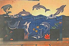
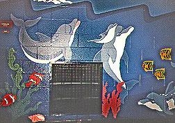
| EXAMPLE #1 In the first example, I was redoing my web site and wanted to enlarge the images since today people have faster internet connections and I no longer have to make my images the size of postage stamps. I was dealing with the images of a mural I painted years ago. I couldn't locate the original photographs to do a re-scan (my house is much bigger and more disorganized than my hard drive), so I had to adjust a scan that I had made about four years ago.
| |
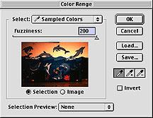 | 2. Now, this was painted in an elementary school gymnasium. The lighting was horrible and when it came time to take the photos, I knew they wouldn't do my painting justice. I was right. You can see that In the center, where most of my camera's flash is focused some decent color and shape differences. But everything else sucks! All of my bright, vibrant colors look dark, and my dark colors look black. Here's where Photoshop comes in. I don't have the capabilities or the desire to go back and re-photograph my mural with decent lighting, so I thought I was doomed to post this bad image you see above. Not so! I was amazed at what Photoshop could do for me. It gave me colors and contrast in areas that looked nearly black to my eye; all in a few easy steps: First, I had to make a selection. If I just started cranking up the brightness and contrast on my entire image, those areas in the center that looked somewhat O.K. would be affected too. Since I only wanted to adjust the dark areas, that's what I selected. A quick way to do that was to use the Select: Color Range... command. With my foreground color set to black, I chose [Select: Color Range...]. |
| 3. When you do this, the areas that will be selected when you click [OK] appear as white in the little black and white preview. (Incidentally, if you want to see the preview in color, as it does in my screenshot, simply hold down the Command key (Windows key=Control)) You can control just how much gets selected by dragging the [Fuzziness] slider. Higher numbers = more is selected, and the maximum is 200. If at 200, you still don't have enough of your appearing white, you can add sampled colors by clicking the eyedropper tool with the plus symbol next to it or by holding down the shift key. Now if you click in your original image (or the little grayscale preview) on a new color that range of colors will be added into the selection. To remove colors from the "range" you can click the eyedropper with the minus symbol next to it or by holding down the option key (Windows key=Alt). You can have hours of fun adding and removing colors and adjusting the fuzziness until you have the areas you want to affect selected. Then click [OK]. |
| 4. Now I've got the darkest areas selected. Next, you should feather the selection. Feathering will soften the edge of your selection and create a more believable appearance in the finished image. If you don't feather, the final image is more apt to look like "something funny" went on there. Choose Select: Feather... and enter a number in the [Feather Radius] field. The number you enter will determine the number of pixels at the edge of the selection that will be feathered. Your choice of a variable depends on the ppi (pixels per inch) of the file. For this image, which was pretty small and only 72ppi, I chose a feather of two pixels. Had this been a much larger image, say 300ppi that I wanted to look good coming out of my printer at 300dpi (dots per inch), I would have typed in a larger variable- maybe 6 to 10 pixels. (Your choice in variable fields such as this, is just something that will just come with experience. To get to know Photoshop better, try out several different options; see what the results are later; then go back by using the history palette or saving at crucial stages, then reverting to the last saved version and trying again. Finally we can adjust the Brightness and Contrast. Choose Image: Adjust: Brightness/Contrast... where you are presented with a couple of slider bars (and variable fields). |
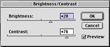
| 5. I'm a slider bar person- they're more immediate and easier to adjust. The adjustment you make to the brightness slider and to the contrast slider will, of course, depend on your image. This is another area you should experiment with; trying out several different setting and evaluating the results. If you've got the preview box checked, you'll see your slider adjustments applied immediately to your image. To get rid of the annoying distraction of the selection marquee choose View: Hide Edges to hide the selection. (There's a keyboard shortcut that's worth memorizing. It's [Command-H] on Mac or [Control-H] for Windows.) You can see I chose a positive value of 28 for Brightness. Positive numbers adjust the selected colors tint (level of lightness), while negative numbers increase its shade (level of darkness). I did more work with the Contrast control, using a value of +76. Contrast affects a color's intensity (the "purity" of the hue). The Contrast control also affects, literally, the contrast of values (lights and darks) in an image. Higher contrast makes the "lights" lighter and the "darks" darker, while lowering the contrast decreases these differences. Here's what happened: Since I raised the Brightness a little first, it made the dark areas of my selection lighter and made the colors a bit more noticeable. Then the contrast brought a heck of a lot more color out of the dark areas by vastly increasing the intensity of the original colors there. Remember, since I had only selected the dark areas of the image, the increase in contrast seemed to only brighten the affected areas. This was the amazing part. Colors that previously looked very dark and very similar suddenly took on a great deal of life and difference. Thank you Photoshop! |
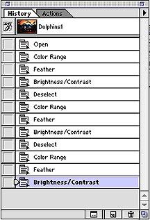 | 6. You've got to play around with the slider bars to arrive at a good adjustment for each individual photo you deal with. Pushing the contrast just a little too far can give your image a horribly unreal look. Having a critical eye and a good sense of what looks real will help. All this comes with practice. Take a look at the history palette after I was done with the image: You can see that I went back and repeated steps 1-4 twice. Each time I deselected and got another color range of the dark values in my image. All this means is that I adjusted the brightness & contrast in stages, so the effect would be more subtle and the dark areas would be as bright and colorful as I could make them. Just 11 actions on my part and while the photo isn't ready to win an award, at least I accomplished my goal of letting people see a lot more color and detail in the mural. Compare the original and the final versions. There's a world of difference after about 5 minutes work. |
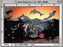
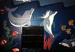  | 7. Lets look at another image from that same mural, this one focusing on a close-up detail of one of the underwater portions. Now that you know how I did it you can compare the before and after versions with an educated eye. While the original is not that bad on this one, the altered image clearly shows more color and contrast in areas such as the lower left corner. (in the center of the image you can see an argument against flash photography) |
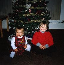 | 8. Here's an image I worked on in December 1998, which uses the tricks I talked about above. I wanted to give my children's grandparents a mousepad with an image of the kids on it for Christmas. So before I printed the Iron-on transfer, I did a lot of work on the image. |
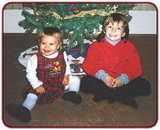 | 9. In the original, the floor is so dark, you can hardly see that my son has legs. He just looks like a floating upper torso. Merry Christmas! Part of the solution involved doing exactly what I did to the mural image above: selecting the dark areas and adjusting the Brightness/Contrast. If my destination for the image was the web, that would have been enough, but since I knew it was getting printed and ironed on a mousepad (both of which will cause the image to lose a lot of it's color and contrast), I went on to do a lot more. I drew and feathered selections around my children's bodies so I could work on the background without affecting them and vice-versa. I did a color-range selection for several individual colors and cranked up the saturation to make very intense, colorful hues (such as in the greens of the tree.) Now if you're preparing images for your web site, or any destination, you can help your lousy, dark snapshots look a little more presentable. Happy Image Editing! |

0 comments:
Post a Comment